Project Description
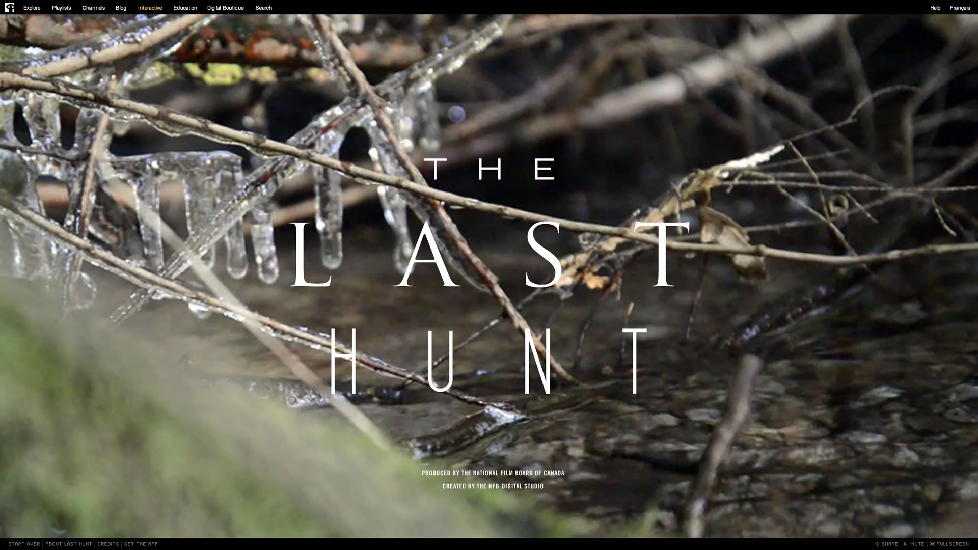
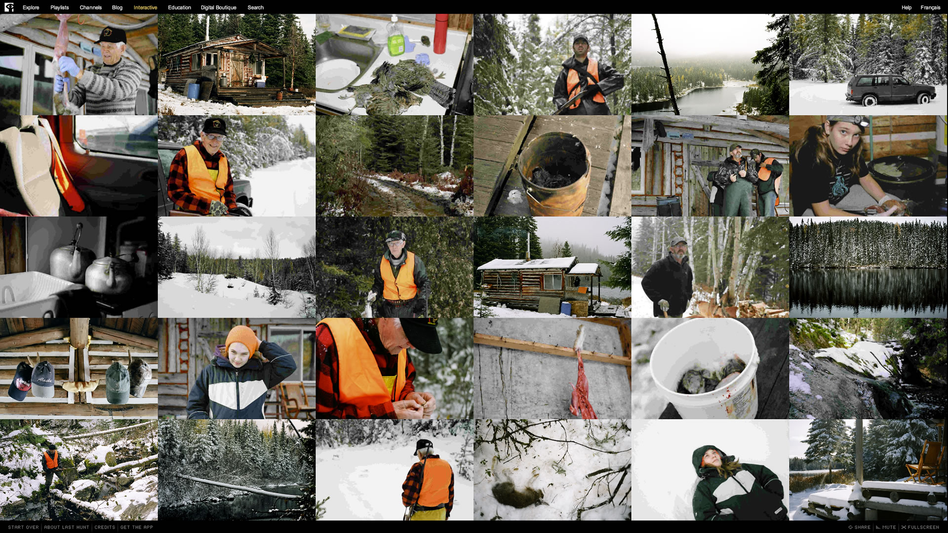
The Last Hunt is an interactive photo essay about the strength of family bonds, tradition and a cabin in the woods.
In 2009 Montreal-based photographer Alexi Hobbs documented the final hunting trip of his 90-year old grandfather Antonio Pit Allard in a photo collection called Hunters & Heirs. The NFB discovered the photos online and saw potential in them as an interactive photo essay. After contacting Alexi, a story was written that explored Pit’s life in the Gaspesian peninsula of eastern Quebec, dodging the WWII draft by hiding in the woods of the Matapédia Valley until the war ended. The story weaves together past and present, touching on themes of transition, family and the similarities of hunting and photography.
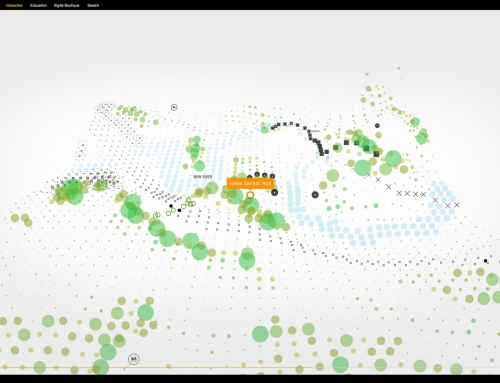
Sometimes stories and content immediately suggest their ideal form – this was not the case for The Last Hunt. It took three prototypes over the span of three years to find a form that would do justice to the story and photos. During that period the technology landscape changed significantly, opening up possibilities around what an interactive photo essay could be.
- iPad introduced (April 2010)
- Adobe AIR for iOS and Android (Feb 2011)
- Death of Flash on mobile (Aug 2012)
- Rise of HTML5
Audience expectations around experiencing media also shifted during this time. People were spending an increasing amount of their time on mobile devices instead of desktop computers and using apps instead of websites. One of the goals of the NFB is to make its content available to Canadians where they can experience it. Sometimes this conflicts with goals surrounding innovation, but in this case the two goals were aligned. The Last Hunt was to be made available in 8 versions:
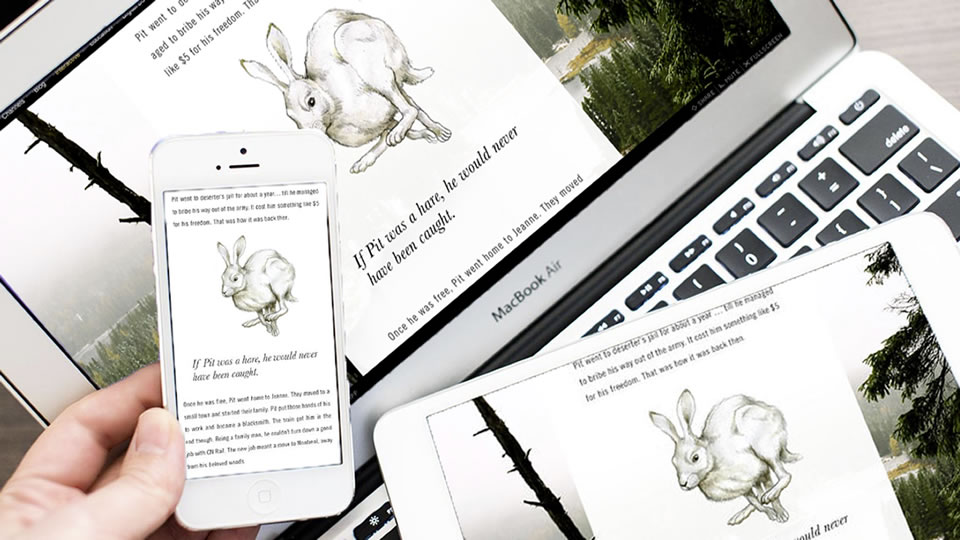
The Last Hunt – Multiplatform
- iPad English
- iPad French
- Android English
- Android French
- Web English
- Web French
- iPhone/iPod English
- iPhone/iPod French
Platform Selection
The NFB is technology-agnostic when it comes to selecting the platforms on which to develop an interactive project. The requirements of a particular story ultimately dictates the chosen platform. The Last Hunt had the following criteria:
- Audience availability
- iPad
- iPhone
- Android
- Desktop web
- Expressive creative tools
- Audio support
- Animation workflow
- Typographic design
- Customizable UI
- Smooth, responsive interaction (60fps)
- Cost-effective
- Purchase cost
- Development cost
- QA cost
- Maintenance cost
This criteria narrowed down the platform options to Native, HTML5, and Flash/AIR.
| Native | HTML5 | Flash/AIR | |
|---|---|---|---|
| Browser support | No | Yes | Yes |
| App support | Yes | Yes (PhoneGap) | Yes |
| Audio support | Good | Poor | Good |
| Animation workflow | Poor | Poor | Good |
| Typographic design | Fair | Poor | Good |
| Customizable UI | Fair | Poor | Good |
| Mobile Performance | Good | Poor | Fair |
| Platform cost | $99 | Free | Free |
| Development cost | $$$ | $$ | $ |
| QA cost | $ | $$$ | $ |
| Maintenance cost | $$ | $$$ | $ |
Native app development was ruled out because of the development cost. After having spent most of the budget on the two previous prototypes, there wasn’t much left. The absence of browser support was also an issue because most of the NFB’s audience were still accessing interactive projects this way.
HTML5 was ruled out because of poor capabilities around artistic expression. At the time, mobile browsers only supported 1 audio channel. Audio is a subtle but very important part of the NFB’s interactive projects. The ability to seamlessly loop audio and crossfade between multiple audio tracks is a minimum requirement. The animation tools for HTML5 were also quite limited. It was either programmatic tweens or spritesheets – neither of which are artist-friendly enough to allow for the subtle tweaking required late into production. Finally, typographic adjustments were limited – the ability to handle custom kerning, letter-spacing, hanging punctuation and dealing with widows and orphans was essential in such a text-heavy project.
This left Flash/AIR as the remaining option. It checked all the right boxes except for mobile performance. There were questions about whether or not a third-party development tool could meet the audience expectations around native performance and responsiveness – we were going to find out.
Performance
The big question with choosing the Flash/AIR route was how well it would perform on mobile. The traditional Flash DisplayList renderer is CPU-based, which makes it very flexible, allowing for seamless combination of vectors, bitmaps, filters, anti-aliasing, alpha channels, and 8-bit masking. However, for the sake of battery life, CPU power on mobile devices is about an order of magnitude slower than on desktops. This potentially meant that an app built with the standard Flash DisplayList was going to feel sluggish compared to its desktop equivalent. After I started prototyping giant parallax images on tablet, I discovered that sluggishness was a real concern. The issue was compounded with the release of high-density Retina displays, which forced the CPU to work even harder trying to render 4 times the number of pixels to the screen. Retina displays were not all bad – they forced the mobile device manufacturers to add more powerful GPUs to compensate for all the extra pixels that had to be processed.
The Flash platform engineering team saw this coming and had been working on GPU rendering for a number of years in the form of Stage3D – an API for rendering GPU-accelerated graphics using a powerful but low-productivity Graphics Assembly Language. Fortunately the Starling Framework project had been making good progress and provided a way to use Stage3D in Flash/AIR while providing a more productive AS3-like API. With Starling we were able to achieve a smooth 60 fps scrolling experience, but GPU-rendering was not without its own issues.
Once image textures are in GPU memory, they are processed at blazing speeds; however there are two issues getting them there: CPU-GPU bus transfer speeds and limited GPU memory. Before an image can be used on the GPU it needs to be transferred into GPU memory. This transfer can be rather slow on mobile devices and has the terrible side-effect of freezing the UI. One technique for speeding up GPU transfer speeds is to use the ATF image format – an uncompressed texture file that is ingested much more quickly in the GPU. Of course, ATF is not a magic bullet, trading off fast transfer speeds for image quality artifacts and giant file sizes. In the end we used a combination of ATF, PNG, and JPG formats.
To achieve a seamless smooth scrolling experience, we preloaded all the image textures into GPU memory at the start of the project – hence the preloader. The second challenge was getting all the image assets to fit within the 128MB app limit for GPU memory. This was quite difficult considering we had 30 photos that were 16MB each at Retina resolution.
Interaction Design
The NFB has done many interactive photo essays prior to this one, but The Last Hunt was the first to take a mobile-first approach to user interface design. Gesture-based scrolling was to be the main navigation interaction instead of the traditional mouse-driven UI. We also took advantage of mobile features like gyroscope and accelerometer motion sensors to drive a subtle parallax motion which gave the elements an extra-dimensional feel.
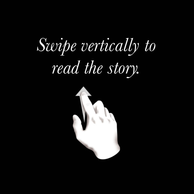
The Last Hunt – Swipe Instructions
In my mind, good interaction design should never require instructions. However, that opinion is based on the assumption that the audience has a basic understanding of the standard interaction model. All those rules were thrown out the window when touch-based mobile devices became popular and the major OS’s had different interaction models. I relented and agreed to have a single instruction at the start of the experience: “Swipe vertically to read the story”. It’s the only cue required to experience the important part of the story. Other interactions are discoverable and enhance the experience: swipe away the text panel, swiping through photos, and tapping to reveal the menu. In some cases we tried to provide visual hints to suggest the possibility of an interaction such as the horizontal sliding transitions of the background photo to suggest that they were horizontally swipe-able.
After determining the interaction design for tablet, we made modifications to take advantage of the unique features of desktop web and phone form factors.
For desktop web we modified the main scrolling interaction to be done with mouse scroll wheel, trackpad swipe, draggable scrollbar, keyboard arrow keys, as well as mouse click drag & throw.
The small size and typical portrait orientation of phones forced us to use the main viewport for the main story scroll. The photo gallery is accessible by rotating the phone to landscape mode.
The Last Hunt was launched October 2013 and received awards for both its web and mobile versions.
I learned a lot from The Last Hunt. Building and maintaining 8 versions of a project on web, phone, and tablet is quite an undertaking. I was particularly impressed with the Adobe AIR/Flash workflow which made it possible to use over 90% of the same codebase across all the projects. It would not have been possible to achieve the same results with any other technology platform for the same budget and time frame.
| Animation | Flash Professional |
|---|---|
| Audio | Audition |
| IDE | Flash Builder |
| Photos | Fireworks, Photoshop |
| Programming | Actionscript, Starling |
Leave A Comment